Imaging and Design for the Online Environment
It is discussed by the different element of arts when your using technology to edit and also, the five main online file formats that was used most of the students and workers. Most of the information art is known as infographic with their different kind of source where they edit or designing it.
1. Balance

On the screen, the visual weight of objects, texture, colors, and space is evenly divided. A design's balance is critical to its success.
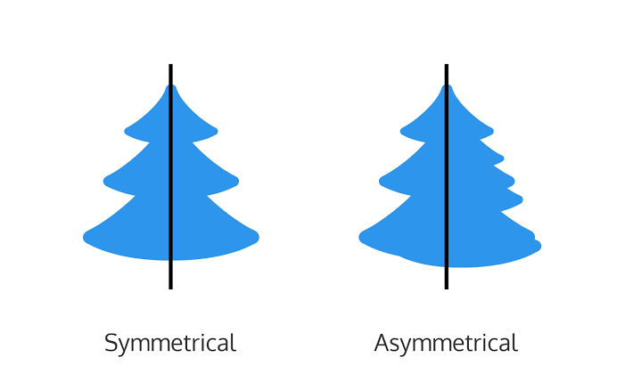
a. Symmetrical Balance
The placement of items in such a way that they are evenly distributed to the left and right, or top and bottom of the center.
b. Asymmetrical Balance
On either side of the page, the arrangement of distinct things of the same weight. Color, shape, size, texture, and value can all be employed to create a sense of balance.
2. Emphasis

A design element that is unusual in size, texture, shape, or color to draw the eye of the observer.
3. Proportion

Visual elements generate a sense of oneness when they work together successfully.
4. Pattern / Repetition / Rhythm

These are the visual elements that repeat on an image or layout to bring the layout or picture together. Visual components that provide a sense of structured movement produce rhythm.
5. Variety
The most effective technique to create aesthetic interest to a page is through contrast. This uses various design aspects to grab the viewer's attention.
6. Movement

The viewer's eyes are guided around the screen by visual elements. Movement is the lack of text and imagery, as well as the art of nothing. It basically divides the pieces on the page and gives the viewer's eye some visual breathing area.
Online File Formats for Images and Text
1. (JPEG) Joint Photographic Experts Group
Digital cameras and other capture equipment most typically use this format.
2. (GIF) Graphics Interchange Format
A sort of image compression that enables you to show rudimentary animation.
3. (PNG) Portable Network Graphics
This format is a hybrid of the two previous formats; it was developed from GIF for the lossless compression feature and for the Internet presentation of images.
Images with a transparent backdrop are also displayed.
4. (PDF) Portable Document Format
This file format, created by Adobe, contains all of the functionality of a printed document as an electronic image, including the ability to print, navigate, and even forward to others.
5. (DOC) Document File
Microsoft designed this format, which is used in MS Word.
Infographics
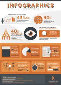
A chart or diagram that is used to represent information or data. It swiftly and plainly conveys a clear message. It captures your attention and delivers a crucial message or imparts vital information.
Piktochart

The average user will find complex data aesthetically engaging.
Canva App

Principles of Visual Message Design Using Infographics
1. Be distinct
Make it memorable and entertaining by putting a unique spin on something everyone can relate to.
2. Keep it simple
Don't cram your infographic with so much detail and irrelevant material that your audience becomes overwhelmed.
3. Be creative and bold
It's critical to make sure your key message is clear and bold.
4. Less is more
A page full of words will almost certainly have less impact than a page full of words.
5. The importance of getting it across
The most critical feature of a successful infographic is an easy way for users to share it with their friends.
Innovational is the outcome of a habit, not a random act.
Sukant Ratnakar